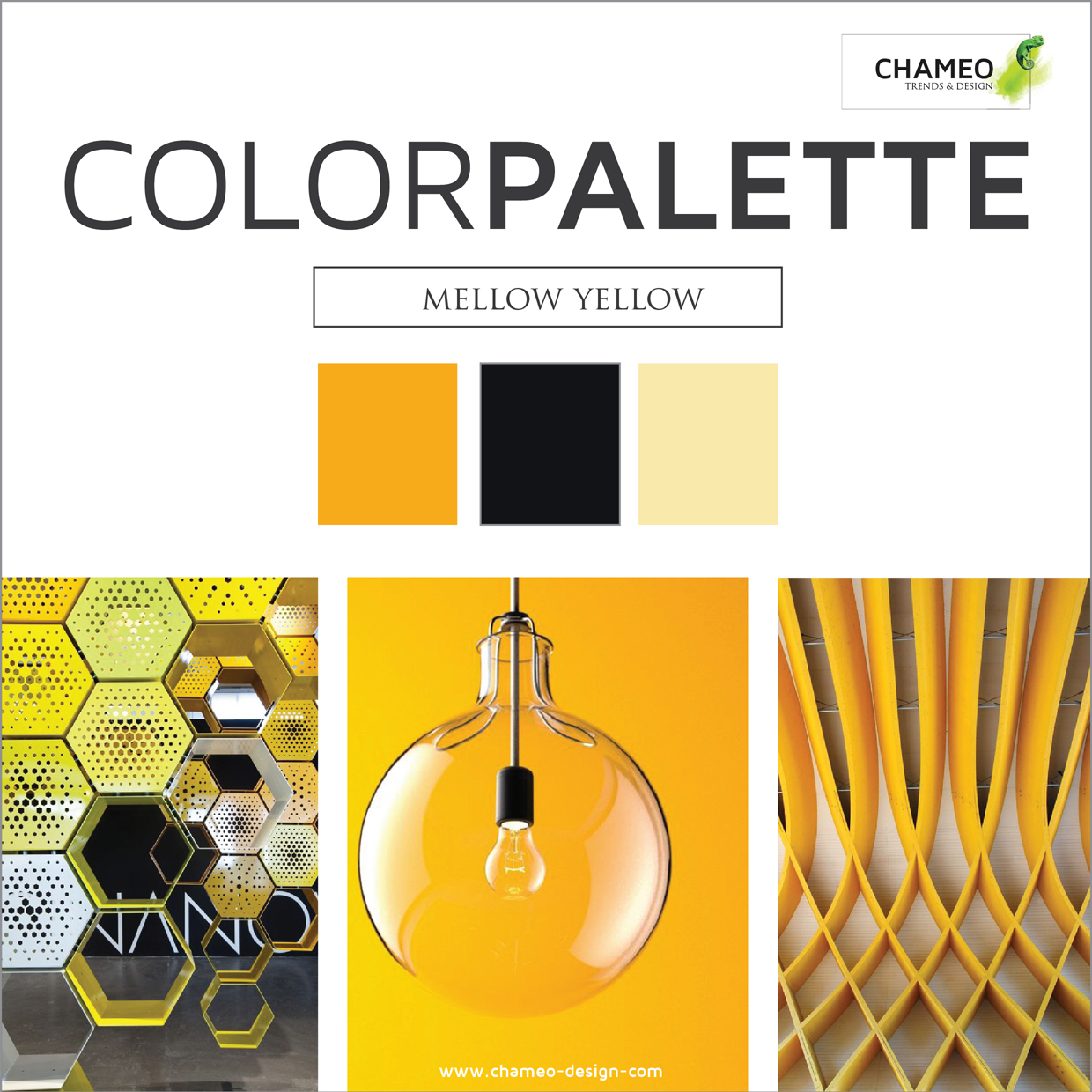
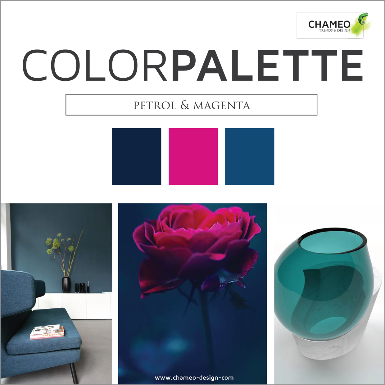
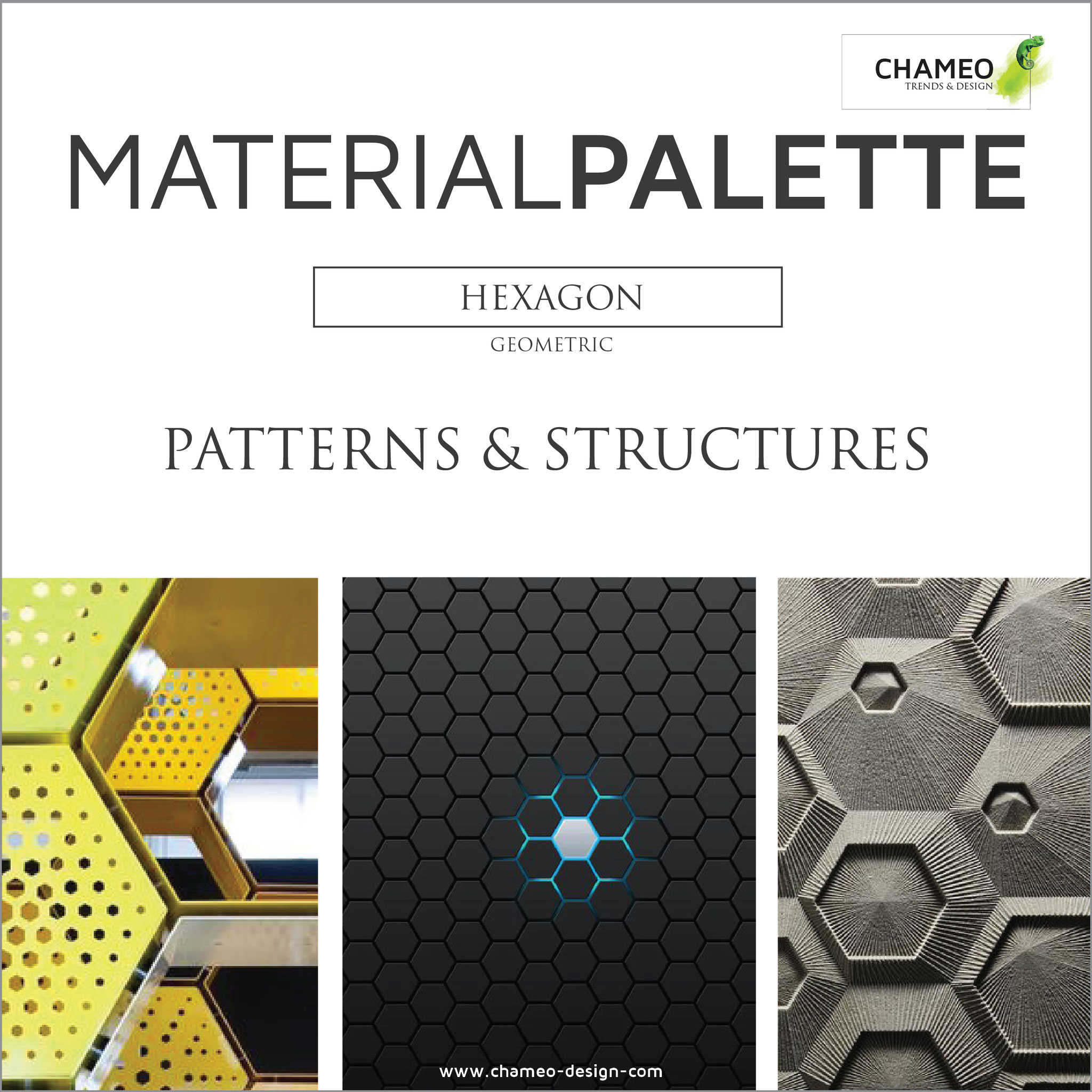
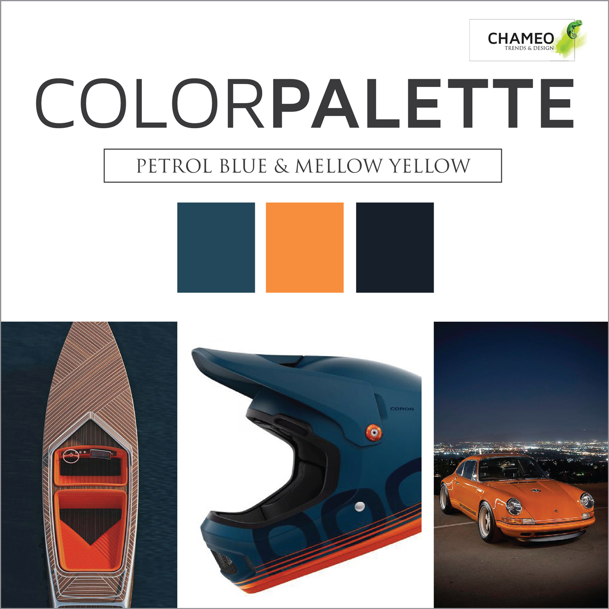
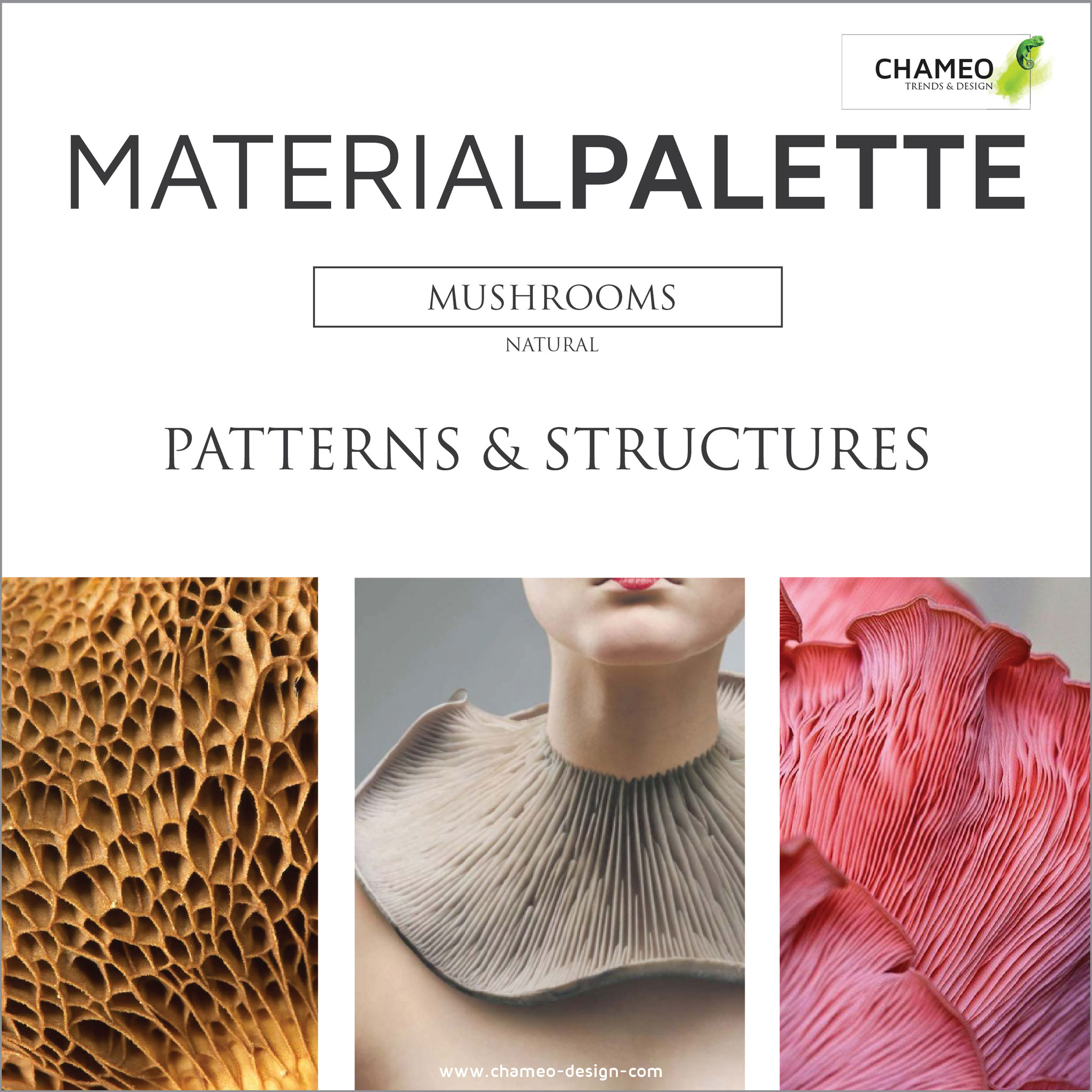
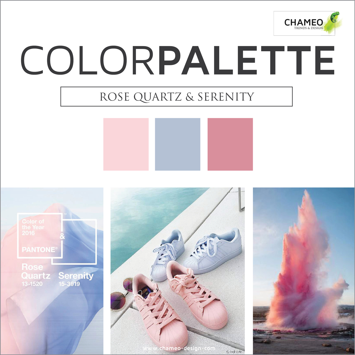
Trend research is one of the key factors of good design, but daily business often doesn't leave enough room for it. With 16 years of experience in the design industry we know, what you might be looking for and created handpicked TREND PALETTES for you.
Which PALETTES are interesting for you?
Design is our passion, creation of aesthetic and well functional items is our daily business. We know the places to look for new trends from graphic to product design, architecture or car design. Especially interesting new material developments, beautiful color combinations & graphic trends stole our heart.
How can Color & Material support me and my business?
- Your products miss the ultimate "WOW effect"? The right choice of COLOR & MATERIAL improve the appearance and improve any sales!
- Need to get in touch with the right material suppliers? We love to support you! Our great network of material suppliers will provide you with tones of interesting samples.
- How to describe exactly what are looking for? We make a bulletproof briefing for your suppliers! INSPIRATION boards clearly communicate the moods, target customers, textures, color triad for your products without many explaination or language barriers.
- How do I know what's possible in material feasibility? We have 16 years of experience in Color & Material design and support you with questions around technical functions, weight, color possibilities, prices, production, minimum purchase and many questions more.
INSPIRATION
You are looking for some inspiring ideas or some beautiful images. You are perfectly right.....
RESEARCH
Keeping up with the latest design trends is essential! Knowing when, where and what's going on in the design business is very important.
All of our pictures are linked to their original sources. Maybe interesting links for you too ?
INDIVIDUAL SUPPORT
Your company is working on a project where trend or design support is helpful. Please feel free to contact us for some help!
Visit CHAMEO DESIGNs BLOG
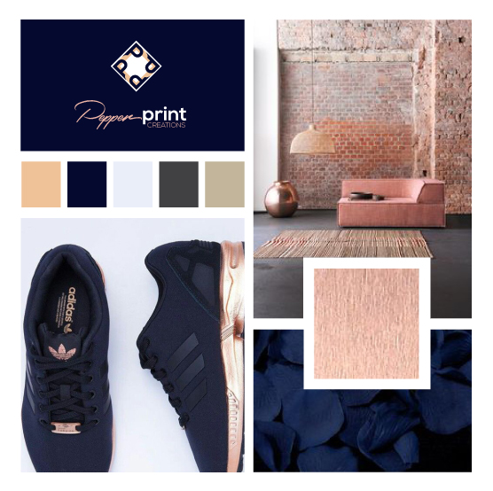
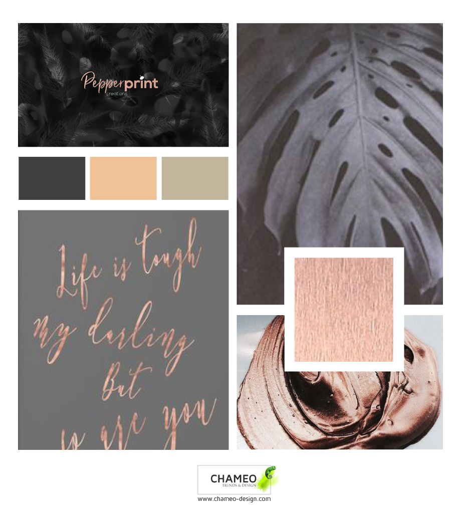
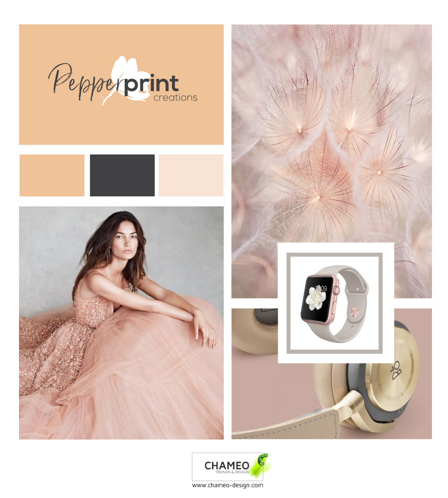
Some great news from our lovely client Pepperprint creations!
Begining of the year we started to work together with Pepperprint creations. Brainstorming their name, setting up mood boards, CI colors, fonts.....
From the very start we had a very good connection and really enjoyed the time working on this great design start up!
The psychology of colors in clothing
Did you know that 90 seconds is all it takes for a product to create an impression? As many as 85% of consumers believe that colour is the chief factor while buying a product.
This means that colours and the psychology of colour plays a huge role when it comes to choosing clothing to buy as well as choosing clothing to wear on a daily basis. Not only can emotions take control over of the colours we choose, but colours can also alter our emotions as well. The colours in clothing can have both an impact on your own emotions as well as the emotions of others.
Depending on the situation you’re in, as you could be dressing for work or leisure, you can choose certain colours in your clothing to reflect the mood you want to convey. For example, bright green is great for anyone in the creative industries as it reflects creative and refreshing emotions. Dark blue is good for conferences as it portrays authority and power and yellow is ideal for social gatherings where you want to reflect fun and energetic emotions. These are just some key examples of the power of colours in clothing.
The guys over at Positive Branding have designed a cool infographic below which pinpoints some of the key psychology behind colours in clothing, covering the different shades of blue, green, yellow, orange, red, black, white and grey and what they might mean. In an easy-to-follow layout, the infographic also pinpoints some of the favourite colours between men and women, as well as some of the least favourite colours.

WHAT IS THE WORLDS FAVORITE COLOR?
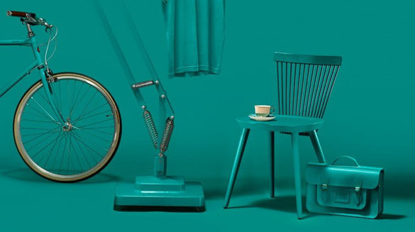
Everybody has his own favorite color. It mirrors our personality and has influence on how we act and how other people perceive us. That is the reason why GF Smith started a challenge together with the design agency„Made Thought“ as well as Hull, the british capital of culture 2017.
6 ways how "millennial PINK" gets the eyecatcher of the furniture show in Milano
Read More 0 CommentsHow the new innovative transparent leather enters the fashion industry!
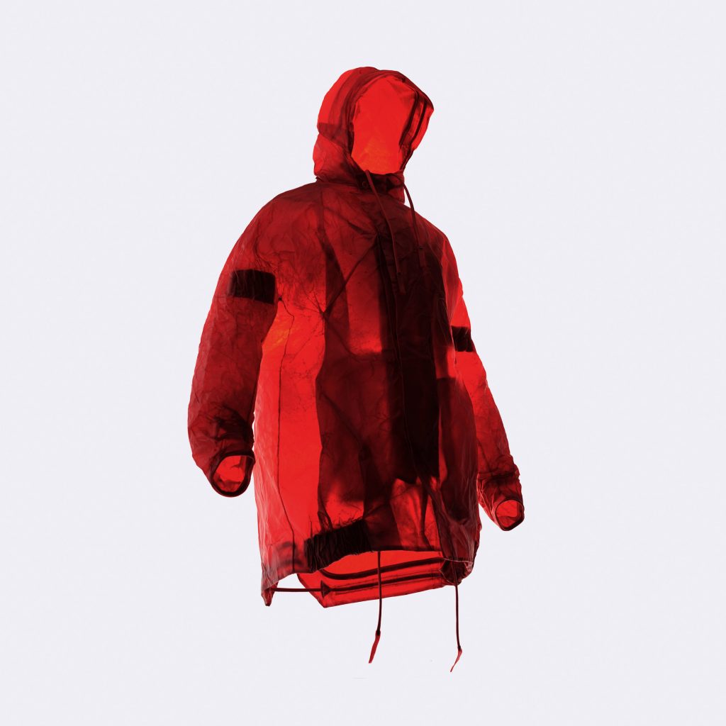
Fashion designer Sruli Recht used transparent cow skin leather to create the Apparition collection for Dutch company ECCO.
The collection is the result of a three-year project, during which Recht and a team from ECCO's Netherlands leather lab aimed to create the world's first transparent cow-hide leather.

